Woody Olsen
Woody Olsen is a local watercolor artist living in Madison, WI. He needed a clean, minimal portfolio website to showcase his pieces and have a place for gallery owners to view his work. He did not have a website but he did have an instagram account.
Woody did not have a previous website. We had an initial conversation based off a quick questionnaire I supplied him. From that conversation we were able to develop the goals for his site. The goals for his website were to showcase his work, attract gallery owners or potential buyers and provide a way to contact him and connect his instagram account.
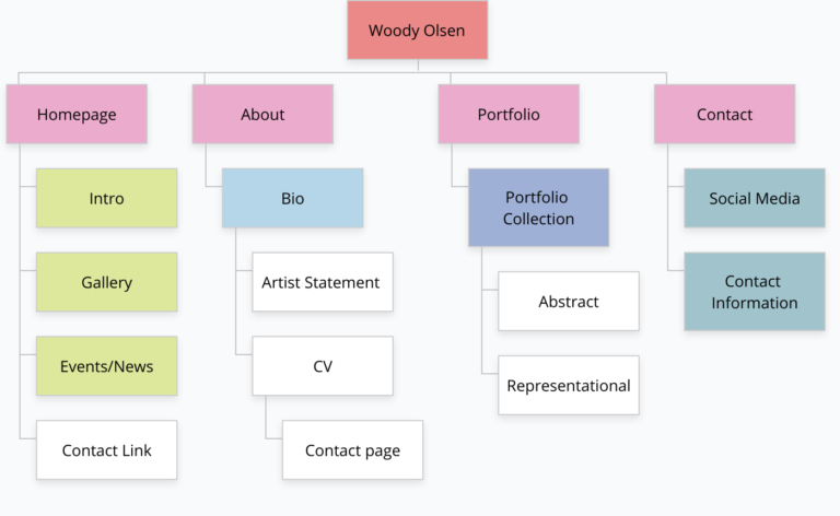
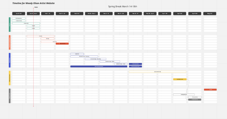
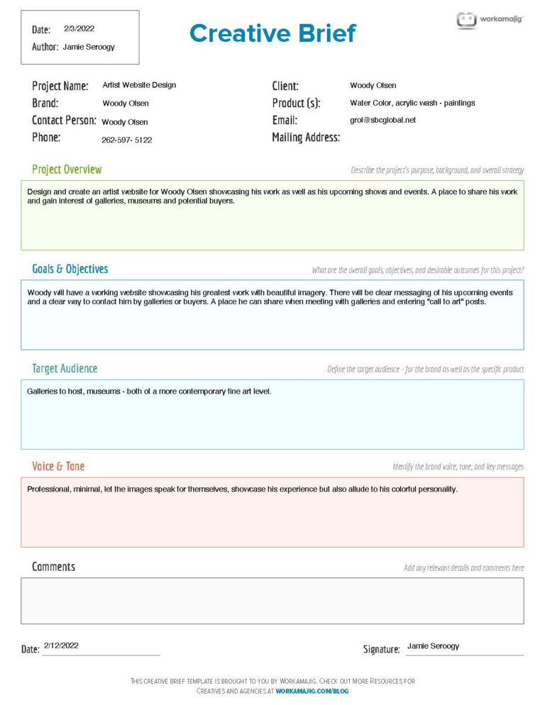
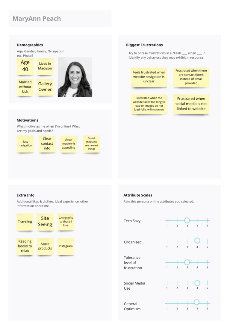
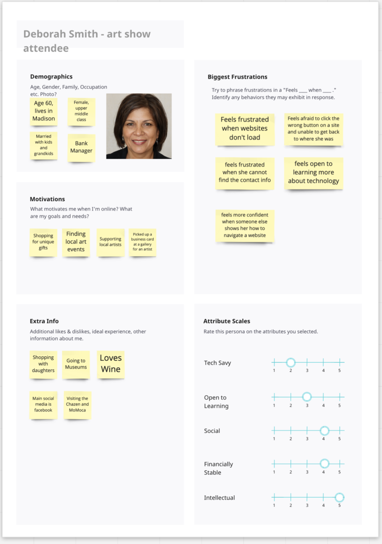
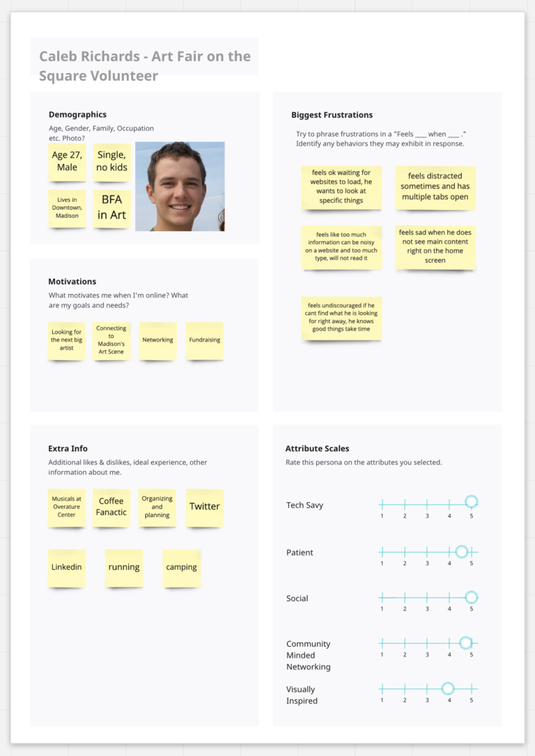
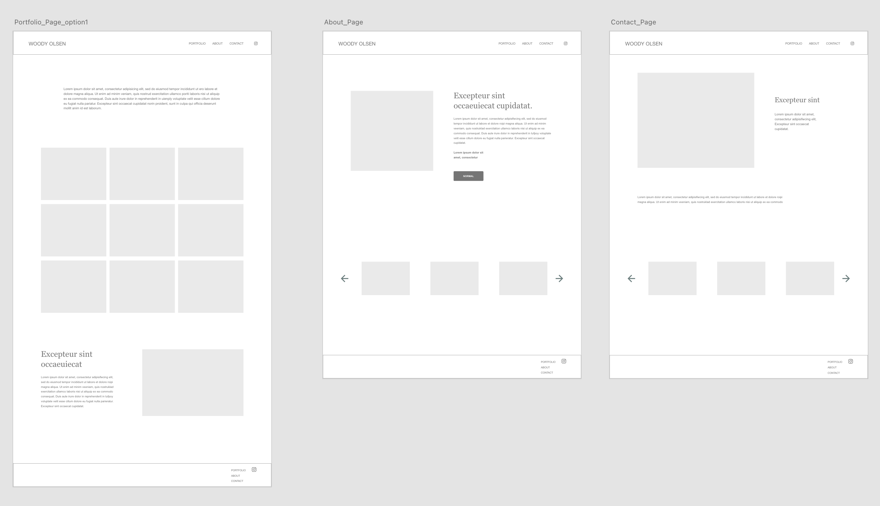
After the first meeting, website planning began with a timeline to stay on track and communicate, a site map, creative brief for the scope and developing personas of users for his site based on his goals and wire frames.
Having the creative brief to make sure we stayed in scope was very helpful. We determined early that he did not want to sell his paintings on his site or worry about e-commerce. This document made sure he knew what was determined as the project moved along.
Understanding the personas we created helped make the decisions to really focus on the art by keeping the site minimal. Woody’s watercolors are beautiful and full of color, I did not want to distract any potential gallery owners or visitors by tons of content, animations or other bold colors. Using his own painting as inspiration for the little color we did add really pulled it all together.
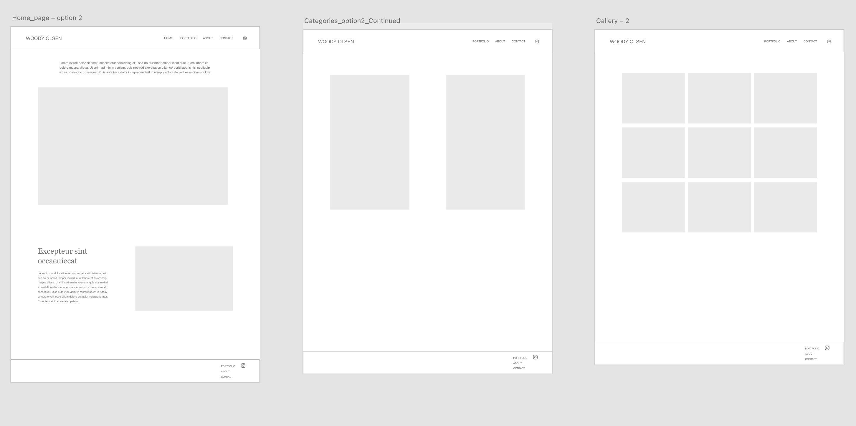
During the initial planning stage, Woody had mentioned wanting to have his portfolio page along with categories. I thought the home page could be the portfolio but was able to give him a second option showing a large image of one of his pieces and some upcoming events.
I was able to figure out the categories option by breaking them up intro groups on one page – instead of creating too many unnecessary pages.
The wireframes above show the categories option before I found the solution.
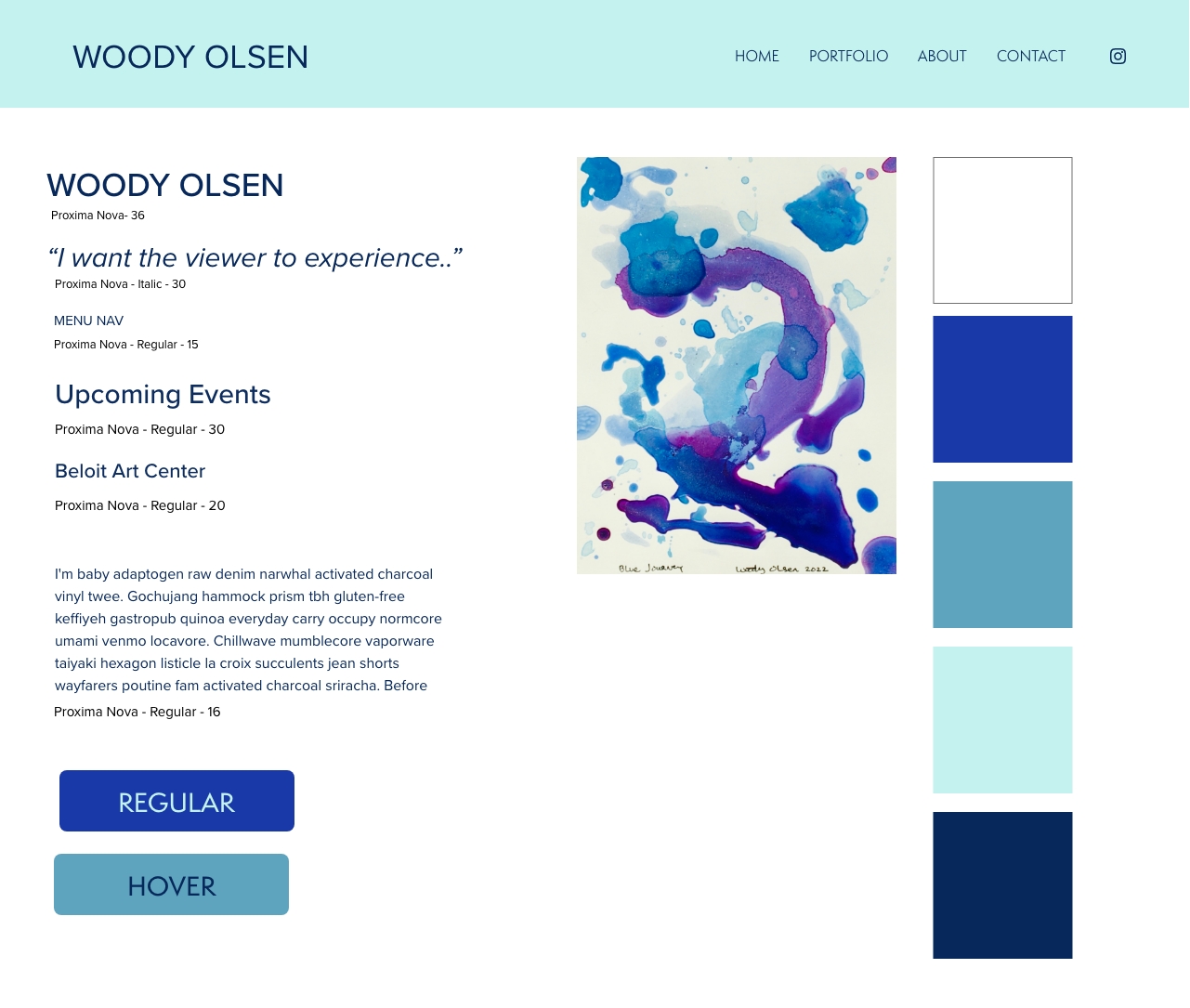
A painting of Woody’s called “Blue Journey” inspired the color palette for the site.
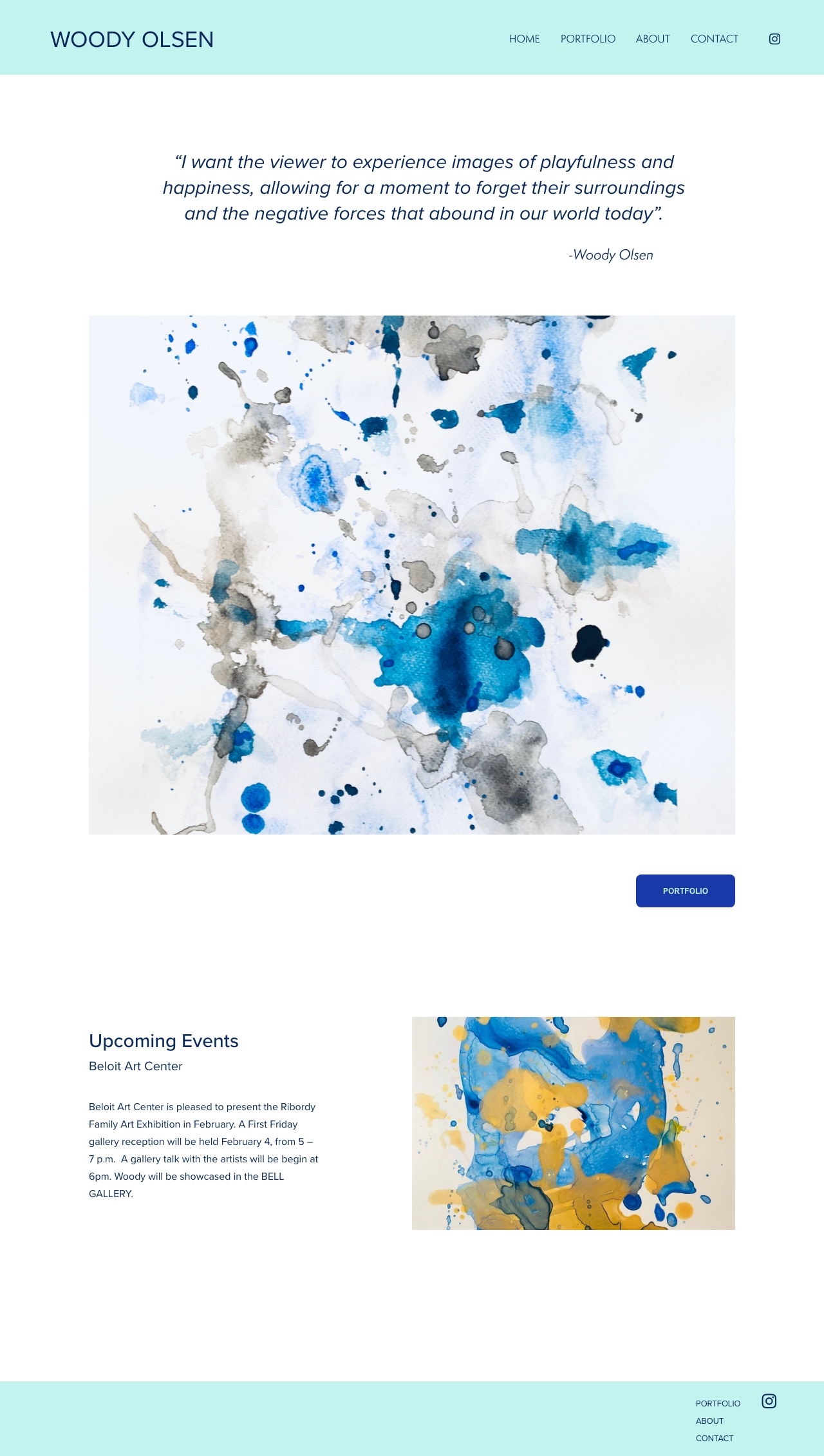
Homepage
The homepage is above. Woody appreciated the colors, liking how calming they were and minimal the design was.
Visit the live site by clicking the button below!
